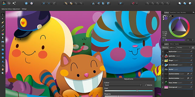
Most designers coming from Adobe Illustrator may think making the switch to Affinity Designer is a trivial task due to its similar look and layout. This guide is meant to highlight and explain some of the subtle differences and quirks I stumbled into when I first started using Affinity Designer.
This post gets updated while I am learning more about Affinity Designer. You can grab a 10 day trial version of Affinity Designer on their website. Share your experience in the comments and be sure to leave any questions you have here!

Tool switching
And while you definitely need graphic design software, you don’t necessarily need Adobe Illustrator. Affinity Designer is a great choice for you, since it’s a low-cost way to experience virtually all the features of an app like Illustrator, but at a fraction of the cost. Affinity Designer is normally available for $49.99. This is a one-time fee, with no subscription or renewal charges, and as of this writing, future upgrades. Similar to Illustrator, Affinity gives you the ability to use the Shift key to constrain the proportions of the shape while dragging (useful when creating squares, perfect circles, etc.), and/or the Control key to draw or resize the shape from the center out.
Switching from one tool to another works the same as every other application. Pressing the same key twice is a bit different however which took me off guard.
Hitting the same key toggles you to the previously selected tool or cycles to the next tool of the same type. Having the Artistic Text Tool (T) selected and pressing T again would switch the active tool to Frame Text Tool (T) for example.
Selection behaviour
Affinity Designer’s default selection behaviour only selects items completely within the bounds of the marquee selection of the Move Tool (V). I prefer to be able to select all of the items touched by and/or within the marquee selection. Fortunately this can be enabled at Preferences > Tools > Select object when intersects with marquee selection.
Another setting I recommend turning on is Preferences > User Interface > Show selection in layers panel, this makes the layers panel scroll to and highlight the item you have selected, this is useful when making clipping masks for example.
Clipping Artboard/Canvas
Affinity Designer makes a distinction between artboards and canvases, a document without any artboards is a canvas and always clips all shapes. Uncheck View > View Mode > Clip to Canvas to turn off clipping or use the “” Hotkey.
Artboards also clip shapes, but dragging shapes out of an artboard makes them visible. This works if the shape is moved completely outside of the artboard. It’s not possible to turn off this behaviour unlike canvases.
Illustrator Affinity Designer
Clipping Masks

Clipping masks are a powerful tool in a non destructive work flow but work quite different from Adobe Illustrator. Select which items you want to mask and nest them under a parent shape, this shape now functions as a clipping mask. Nesting items in the Layer tab is a bit precise however, more on that later.

Finish Typing
In Adobe Illustrator cmd + return is the shortcut for finishing typing. The same key combination converts the shape to outlines/curves in Affinity Designer. Press escape to finish typing instead, I learned this the hard way.

Typos
By default Affinity Designer has a spell checker enabled, something I didn’t expect. Spell checking can be very helpful but I find I have it disabled most of the time to keep those red lines out of my designs.
Spell checking can be disabled by toggling Text > Spelling > Check spelling while typing. Alternatively you can get fix those typos by using Spelling Options ( Shift Command ; ) This lets you review the errors and change them quick and easily.
Pathfinder & Align Tab
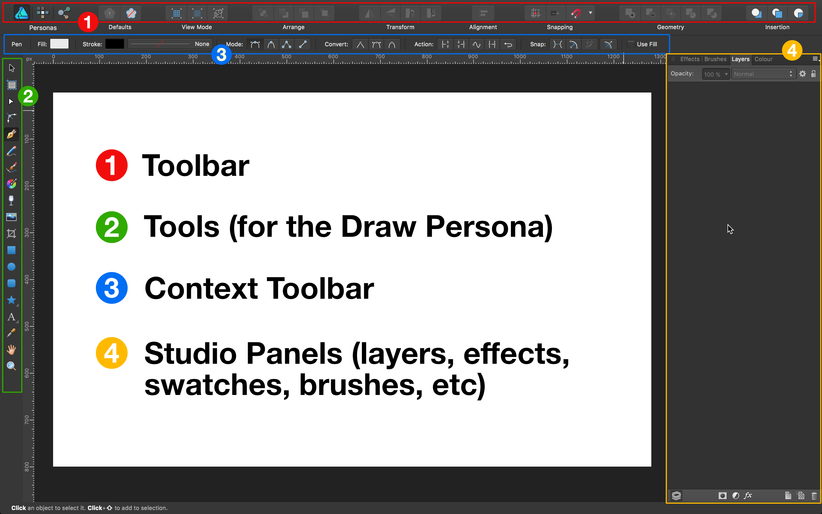
Affinity Designer has no separate tab for boolean operations and aligning functions. These tools are always in the top bar unless you remove them yourself. The align functions are somewhat hidden in the top bar but are often found in the context toolbar when needed.

Minimising tabs
Affinity Designer’s user interface can get quite claustrophobic if you’re using all its features. In Illustrator its self explanatory hot to minimise a tool tab. In Designer you can minimise a tab by clicking on the name with your middle mouse button (MMB).
I hope Serif will implement Illustrator-like tabs as this behaviour doesn’t seem very intuitive.
Colors in Tools panel
For some reason the current colors are not displayed in the Tools panel by default, opposed to how it’s always visible in Illustrator’s toolbar. Fortunately it’s possible to change that!
By going to View > Customize Tools… and then setting the Number of Columns to 2. After closing the customization panel your current colors will show up, right where they should be.
Color Picker in the Color panel
You may have noticed the Color Picker tool in the Color panel, this one works a bit different from the regular Color Picker tool. This color picker is used by clicking and dragging it over the color you would like to pick. After doing so the color will be stored in the picked color swatch. To actually apply this color you will have to select an object and press the picked color swatch.
I suppose this can be used to temporarily store a color as opposed to adding it to your swatches.
Affinity Vs Adobe
Related articles
Affinity Designer
Please enable JavaScript to view the comments powered by Disqus.